Wednesday, 21 December 2011
Why i removed the gradient on: cover, contents page and double spread page?
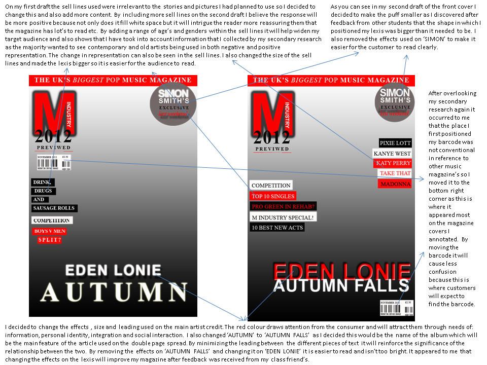
When asking the target audience what could be improved on my magazine to gratify the needs and expectations the majority of the feeback included either chaning the colour of the text or removing the gradient to enable the consumers to read and view the text easier. I choose to remove the gradient as I also found In my own secondary research alot of rpint based media use white background's to ensure the text and pictures are main priority for the reader. After reviewing the changes I decided the magazine will need improving further as the white background can also be a negative as It makes the magazine pages look plain. As of yet, I'm not sure what changes I will make but It will become more clear when I collect further feedback and continue with my secondary research.


Monday, 12 December 2011


Thursday, 8 December 2011
Tuesday, 29 November 2011


How were you creative in image taking/ analysis of technology used?
GoAnimate.com: how were you creative in image taking/ analysis of by xx-princesspaige-xx
Like it? Create your own at GoAnimate.com. It's free and fun!
Like it? Create your own at GoAnimate.com. It's free and fun!


Monday, 21 November 2011

Wednesday, 16 November 2011

Monday, 14 November 2011

Tuesday, 8 November 2011

Monday, 7 November 2011


Thursday, 3 November 2011


Tuesday, 25 October 2011


Monday, 24 October 2011


Sunday, 23 October 2011


Thursday, 20 October 2011


Monday, 17 October 2011


Subscribe to:
Comments (Atom)